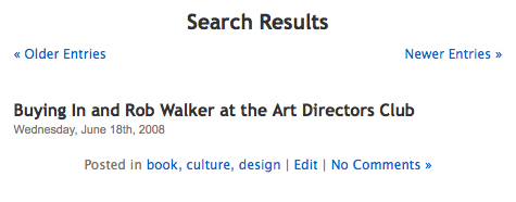
Something has been confusing and annoying me basically since I started reading blogs. It’s one of those slight annoying things, where a little design considering would make the issue irrelevant. When reading or searching blogs, the bottom of the screen usually offers you two choices, of which, the following combination is quite common:
<< Older Entries Newer Entries>>
<< Previous Entries Next Entries >>
Am I the only person who is confused by this interface? Both examples are slightly ambiguous. What does “previous” or “next” mean?
Blogs are generally organized by descending chronological order, that is, newest post on top of the screen or webpage. Books are generally ascending chronologically, if they have a time-based narrative, and start at a point in time and move forward.
Because English is read left to right, the “next” page of a book and navigation pointing to the right refers to pages dates in the future. However, in a blog, “Next” and “arrows pointing to the right” could either refer to blog web pages with posts that you haven’t read yet or a page with blog posts written in the past, ie older then the posts you are currently reading. To further add to the confusion, some blogs use Google as their search engine, which serves results in order of relevance.
To reiterate the two main points of ambiguity:
#1: Blogs and books don’t chronologically map in the same way. Books based on chronology are usually presented oldest information first. Blogs are generally displayed with the newest post first.
#2: Pages in blogs and print don’t map in the same way. The subsequent unread (I’m trying to avoid saying next) page on a blog is going backwards in time. Going forwards in a history book, toward the right, is moving forward in time.
In these two examples, left arrows link to older posts by date and right arrows link to newer posts by date.
Here is the interface of weatherapattern.com, so I write:
Notice the subtle different in terminology in designnotes (composite image):
As mentioned before, the questions arise:
What does “next” mean? That is, does it refer to unread posts or posts dates in the future?
In both cases, when I see “<< Previous Entries,” do the arrow mean the past in time or unread posts?
Why are the older post to the right? If I were to print out a blog and bind it, the older posts would exist towards the right.
Is there a better solution?
I think Gigaom, has a very good solution, part of the time. Instead of using the interfaces of many blogs, they both map to the closest to the print experience as well as have clearer wording.
With this interface, Gigaom both avoids the ambiguity of “previous” and “next.” Using “newer” and “older” clearly refers to date of the posts. Also, the arrow points in a direction that map to the printed out and bound blog. Unfortunately, that interface is only used for the main pages, and not when you search. Sigh.
So, the remaining point is, why should blogs map to the convention of English (or any language read left to right) books? My only response is that most English speakers read books before blogs. It is important for a designer to build upon the obvious reference points and mental models of their users. For blogs in languages the read right to left, such as Chinese or Hebrew, I was have Older Posts pointing to the right.
Now, I have to go try to tweak this site’s navigation.


