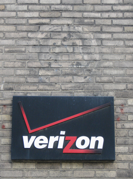
I was walking in Chelsea last Sunday, and approached one of Verizon’s buildings. I wondered if there where any remnants of Saul Bass‘ classic Ma Bell logo. His design was the last in the evolution of the Bell System’s logo, before the 1984 break up of the company. I was surprised, if not pleased, to see that there was, clinging to the side of the brick, leaving a fading trace of the past. I was not exactly pleased, because the logo’s successor fails to reach the original’s greatness.
The Ma Bell logo was strong, clear, and confident. (Look at the red check of the other logo, off balance, ready to tip over.) Bass designed a bell, for a company named after Alexander Graham Bell. He is credited for inventing the telephone, which rang. The logo was created back into the days of monopolies over start-ups, land lines over wireless, circuits over IP, a few indestructible phones styles over a multiple of unusable bricks, expensive long distance over universal access, clear voices over shouting through static on sidewalks, and 99.99% reliability over dropped signals. What governs the features we value, which are often mutually exclusive, in the evolution of something so pervasive as the phone?
I did a quick search for a little more history on the logo. Michael Bierut over at Design Observer, wrote a nice piece in 2005 about AT&T redesigning its logo, which they still use today. He gives the story behind Bass’ original design and his globe inspired logo for AT&T, after the 1984 break of the Bell System. By coincidence, he ended of the piece to commemorate the destruction of Pennsylvania Station forty-five years ago whose anniversary coincided with his Bass-AT&T posting. He said “graphic design, unlike architecture, leaves no footprint.” Perhaps he was wrong.
The shifts of the city, both graphic and architectural are natural. The images on a building’s facade are not quite removed as a snake’s shedding its skin, but decay and erode. An evaporating logo has a half-life, akin to a sweaty glass’ ring left on a coffee table, waited to the properly cleaned or covered with a stack of magazines.


Not only is the Verizon check mark annoying, but the name itself was likely an infringement on another company’s existing mark:
http://www.schwimmerlegal.com/2002/08/inverizon_v_ver.html
Pingback: weather pattern » Blog Archive » Ma Bell Redux